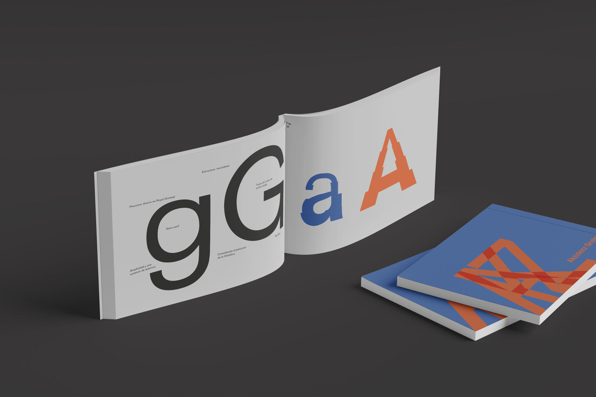
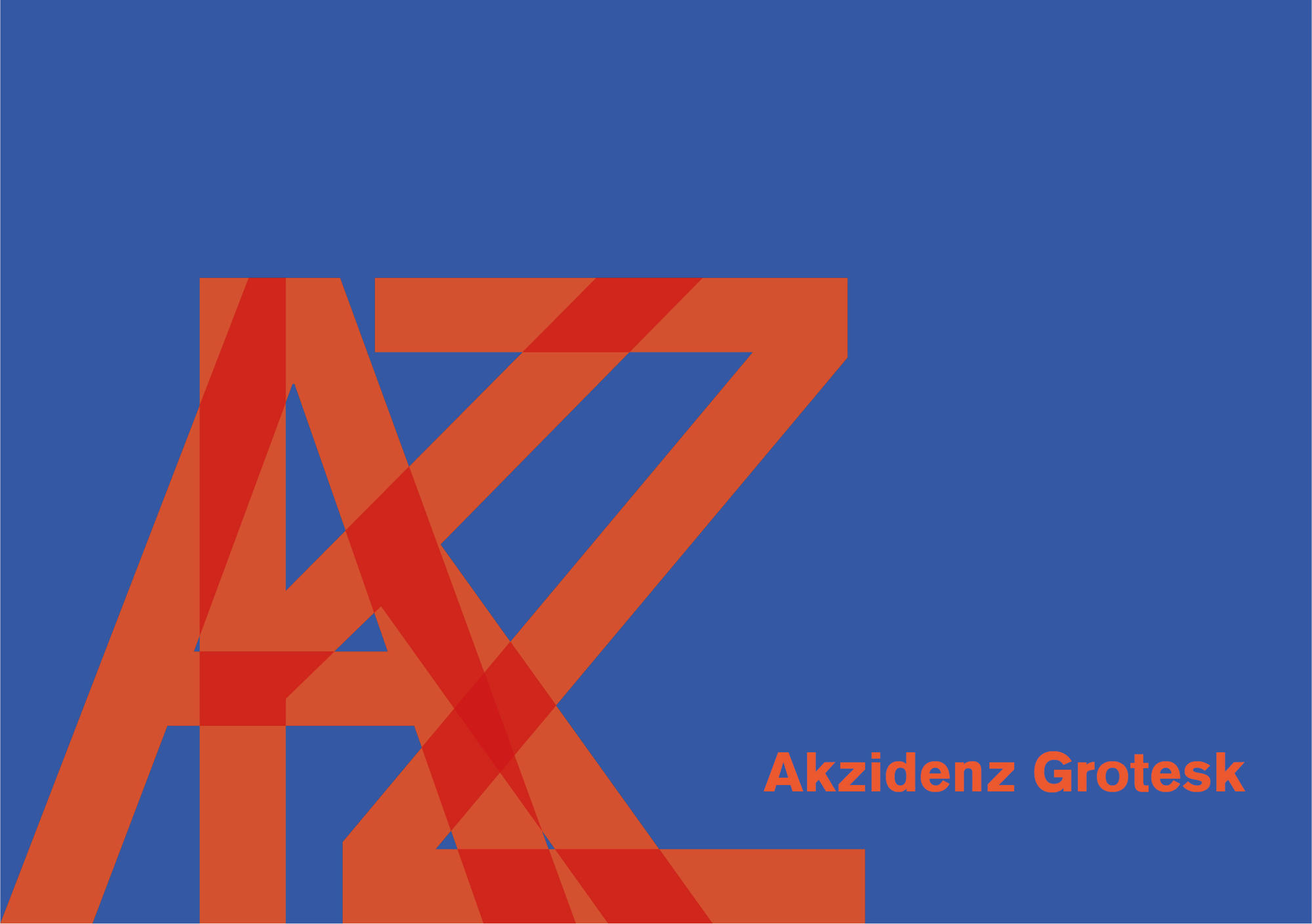
Akzidenz Grotesk
— Typographic analysis
This project focuses on the 3D modeling of a glass bottle for the whisky brand Sirius Dalmore.
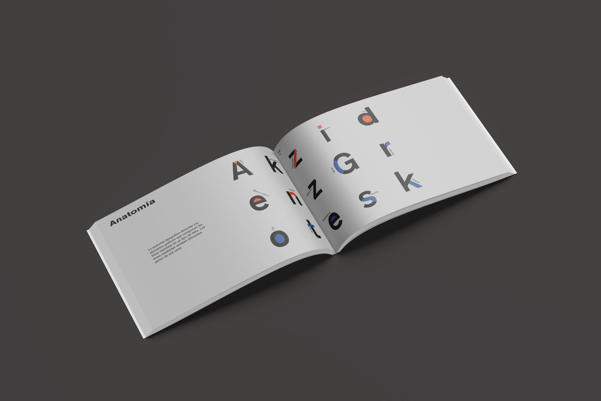
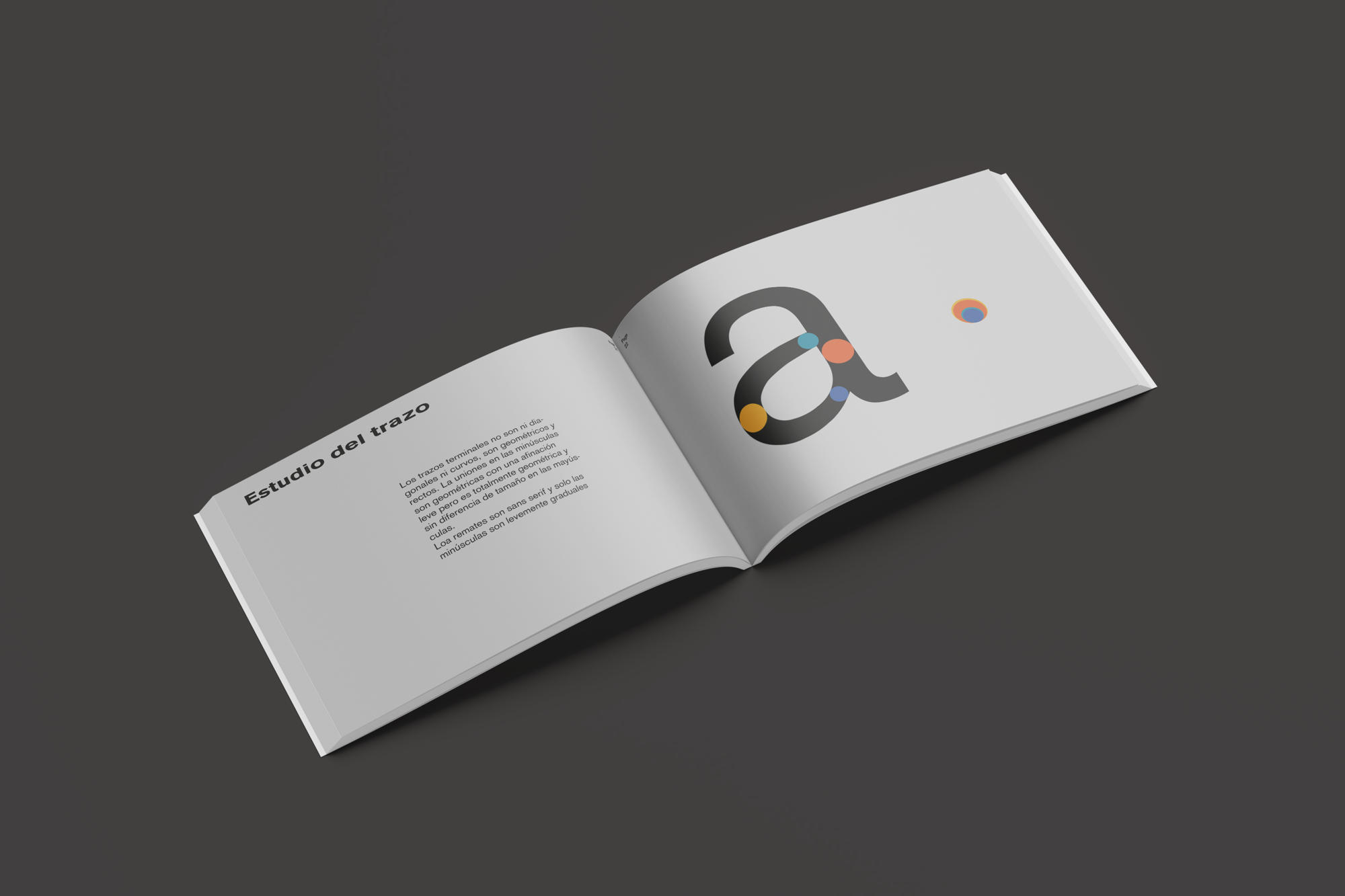
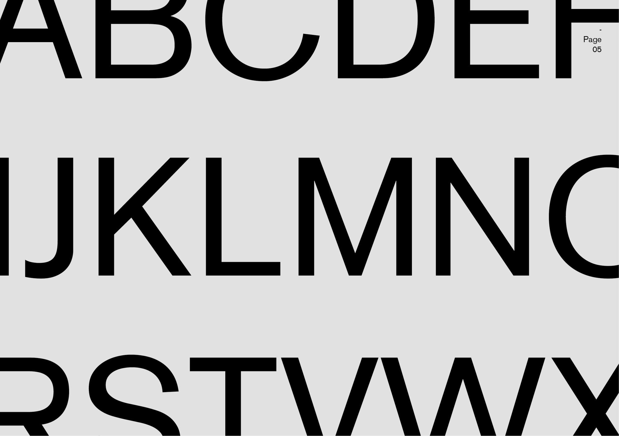
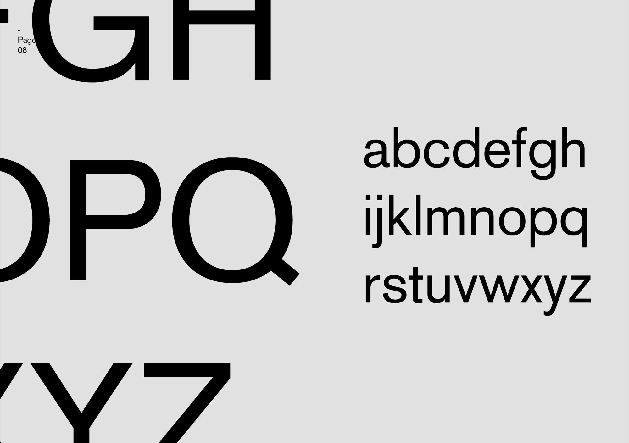
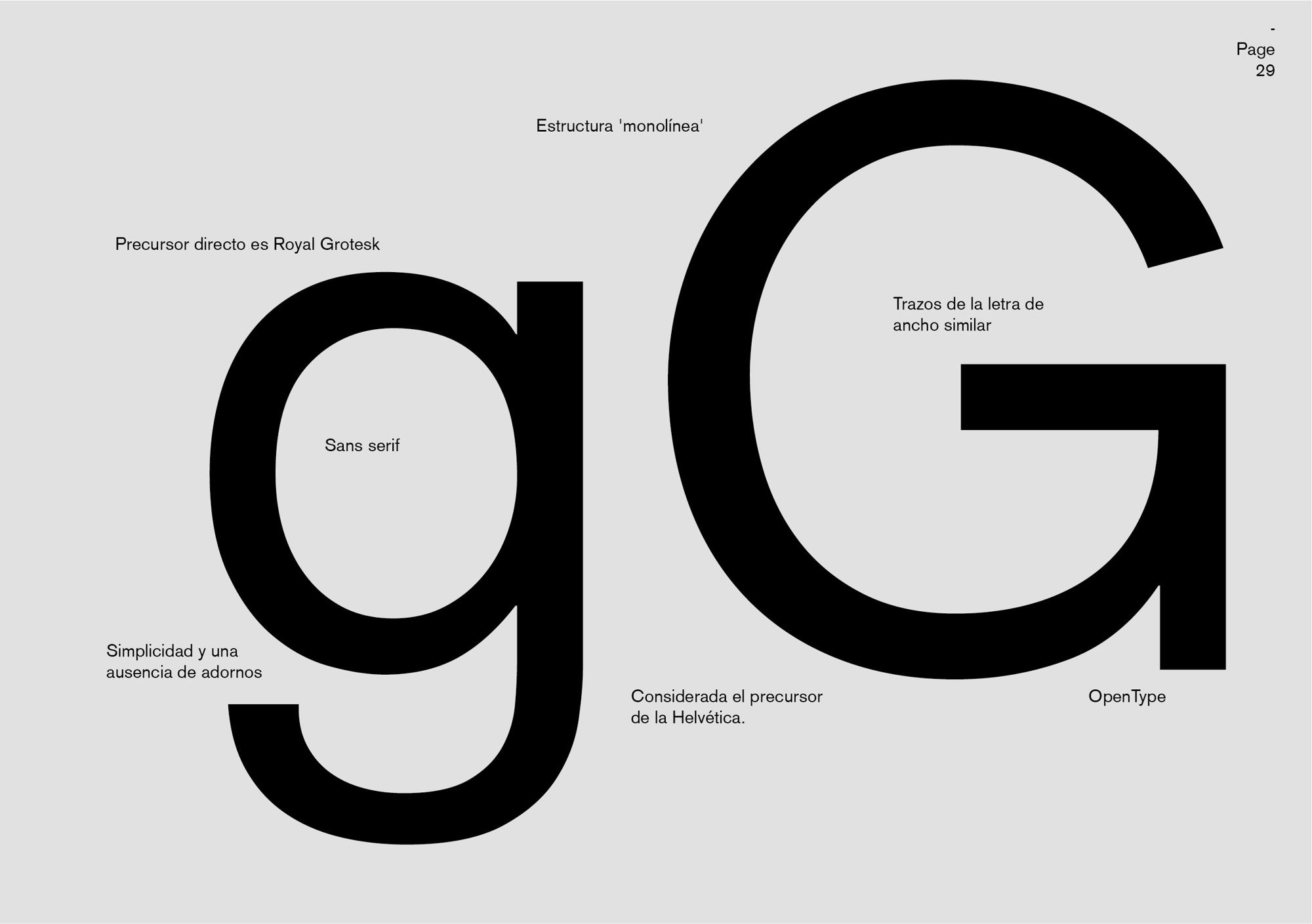
The design of the Akzidenz Grotesk typeface catalog focused on exploring its distinctive characteristics, for which a detailed analysis of the Akzidenz Grotesk typeface was carried out. Akzidenz Grotesk is identified as a sans-serif typeface, recognized for its simplicity and geometry, elements that make it effective both in print and digital media.
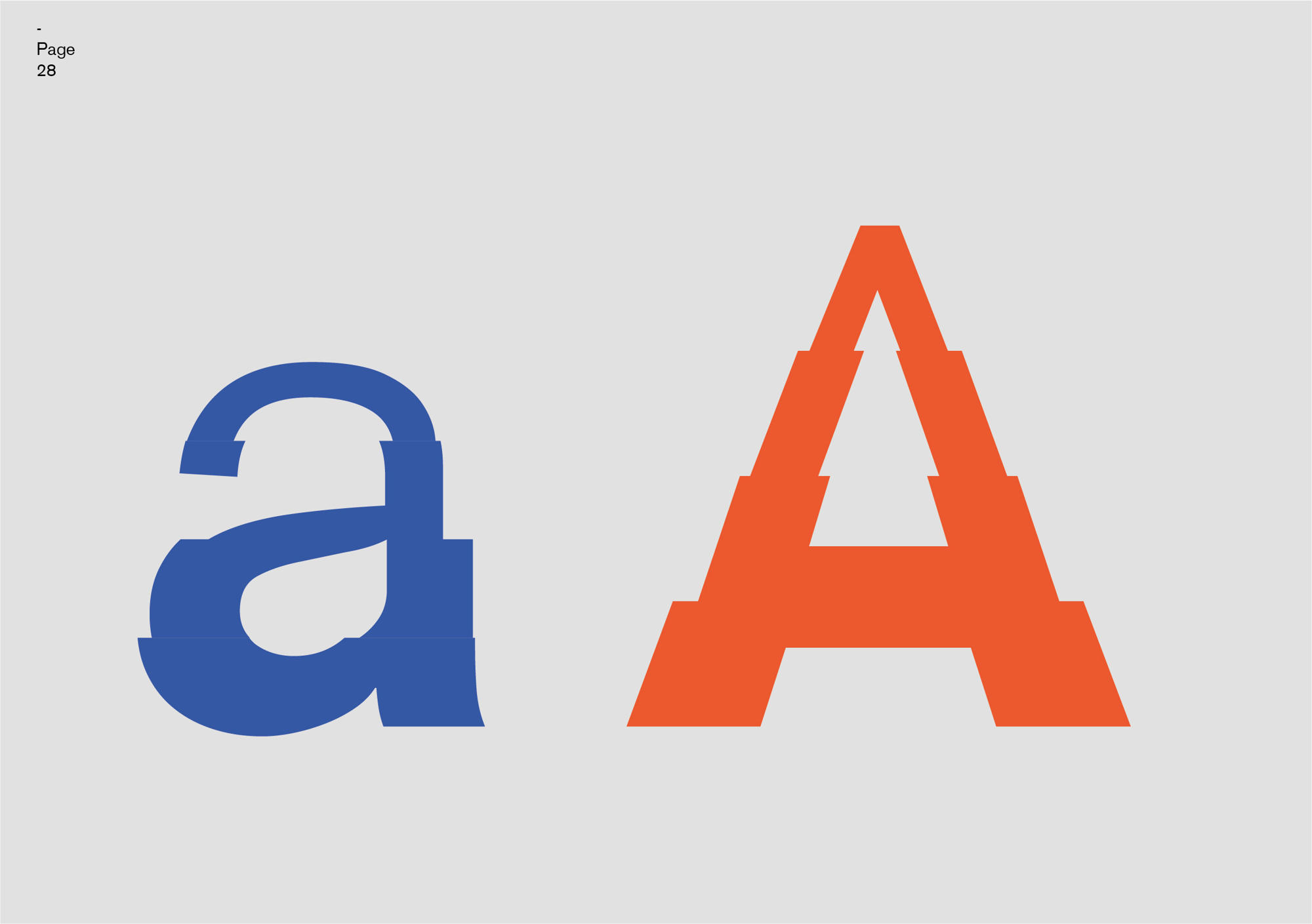
Several fundamental aspects that characterize and distinguish it within the typographic field were explored. The design of Akzidenz Grotesk's typeface catalog included a detailed analysis of its typographic relationships, study lines, anatomy, spacing and counterform. Proportion and stroke were studied, highlighting how its uniform character widths and strokes create a harmonious rhythm. The typeface family and its variants were examined, highlighting its minimalism and clean terminations.
In addition, unique characteristics that distinguish it, such as the uniqueness of the capital letters, were analyzed. The catalog concluded by highlighting the historical relevance of Akzidenz Grotesk and its ability to inspire new creations in graphic design, underlining its versatility and value as an essential reference in the typographic field. The tools used for the creation of this project were Adobe Illustrator, Adobe photoshop, and Adobe InDesign.
